mongoose_logo_red
mongoose_word_logo_red
small_arrow_black
Back to Design Portfolio

Mongoose Router Settings Interface Design

Mongoose Router Settings Interface Design

sketch_logo
illustrator_logo
webflow_logo
mongoose_router_settings_UI1
Project Goal

The Mongoose Interface was specifically designed to allow users to easily configure their devices.

01. Information Architecture

User Flowchart.

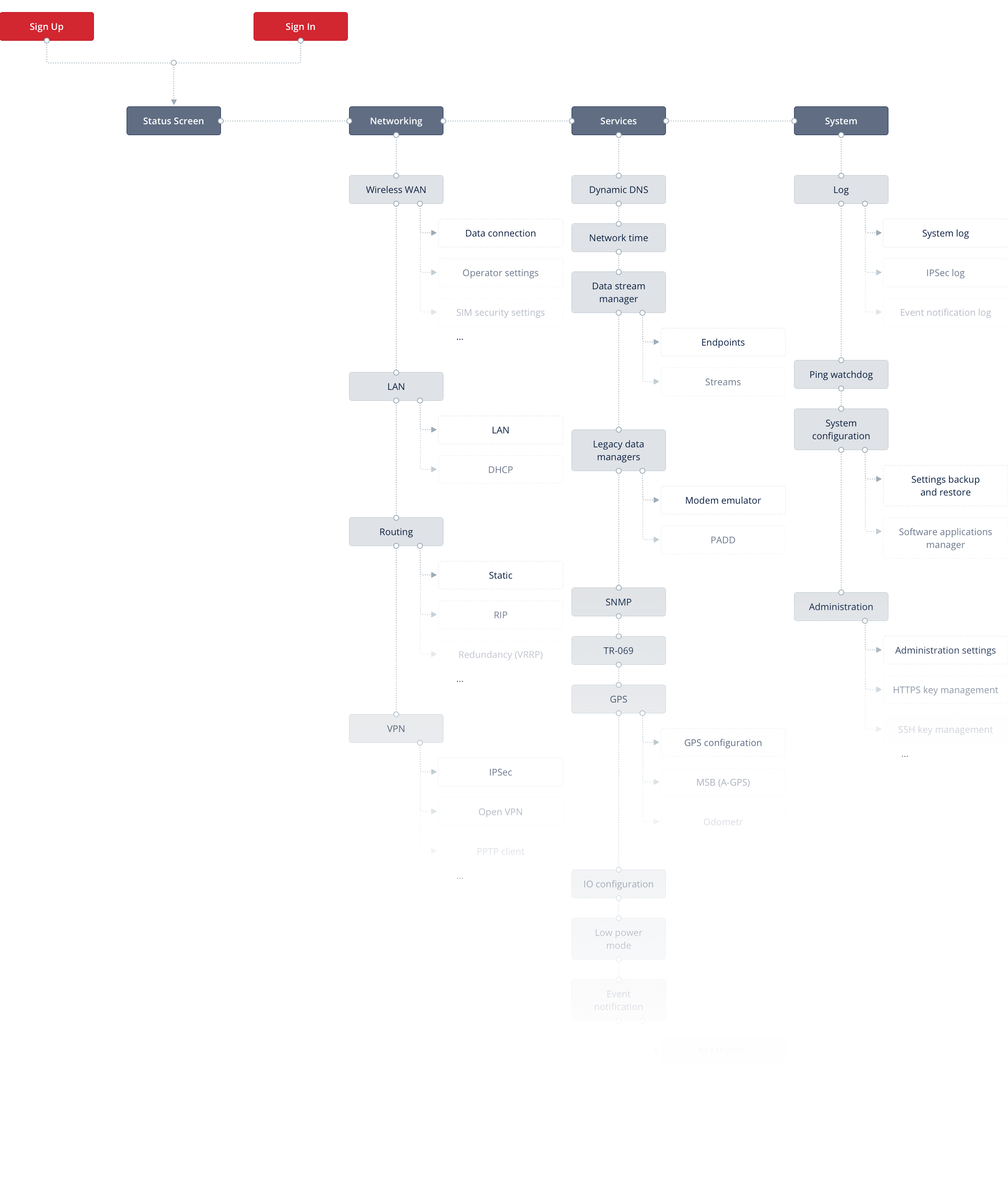
Custom flowcharts are created to explore and validate user journeys.

mongoose_router_settings_flowchart
mongoose_router_settings_sidemenu_popup1mongoose_router_settings_sidemenu_popup3mongoose_router_settings_sidemenu_popup2
02. Prototyping

Wireframes.

Creating wireframes was one of the first and most important steps in creating the Mongoose Interface. Wireframes allowed us to test the interface and its capabilities.

mongoose_router_settings_wireframes1mongoose_router_settings_wireframes2
mongoose_router_settings_wireframes3mongoose_router_settings_wireframes4
03. User Interface elements

Colors.

“Mongoose Red” was created to be the brands accent color. A blue-ish grey was used for UI elements, text, icons and borders.

Pale Sky
#606d83
White
#FFFFFF
Mongoose Red
#D22630
Porcelain
#EAEEF0
White Smoke
#FAFBFB
Midnight Blue
#0B1F41

Typography.

Open Sans is “a humanist sans serif typeface” designed by Steve Matteson, the Type Director of Ascender Corp. This font was designed to appear neutral and friendly. It was optimised for print, web and mobile interfaces, and has excellent legibility characteristics in its letterforms. 

Aa

Custom Icons. 

mongoose_router_settings_iconsmongoose_router_settings_icons

Style Guide.

To ensure cohesion between design and development we created the UI Style Guide. This guide highlights all design elements, including icons, typography, color, navigation menus, dropdown fills, animations, etc.

Buttons
Normal
Hover
Active
Disabled
styleguide_img1styleguide_img2styleguide_img3styleguide_img4
Controls
Unchecked
Hover
Checked
Hover
Multiple
selection
Disabled
Checkbox
styleguide_img5styleguide_img6styleguide_img7styleguide_img8styleguide_img9
styleguide_img10styleguide_img11
Unselected
Hover
Selected
Hover
Disabled
Radiobutton
styleguide_radiobttn_img1styleguide_radiobttn_img2styleguide_radiobttn_img3styleguide_radiobttn_img4
styleguide_radiobttn_img5styleguide_radiobttn_img6
Inputs & dropdowns
Inputs
Normal
Focused
Disabled
Filled
Error
styleguide_inputs_img1styleguide_inputs_img2styleguide_inputs_img3styleguide_inputs_img4styleguide_inputs_img5
Date Picker
Normal
Focused
Disabled
styleguide_inputs_img12styleguide_inputs_img15styleguide_inputs_img13styleguide_inputs_img16styleguide_inputs_img14styleguide_inputs_img17
04. User Interface design

Dashboard.

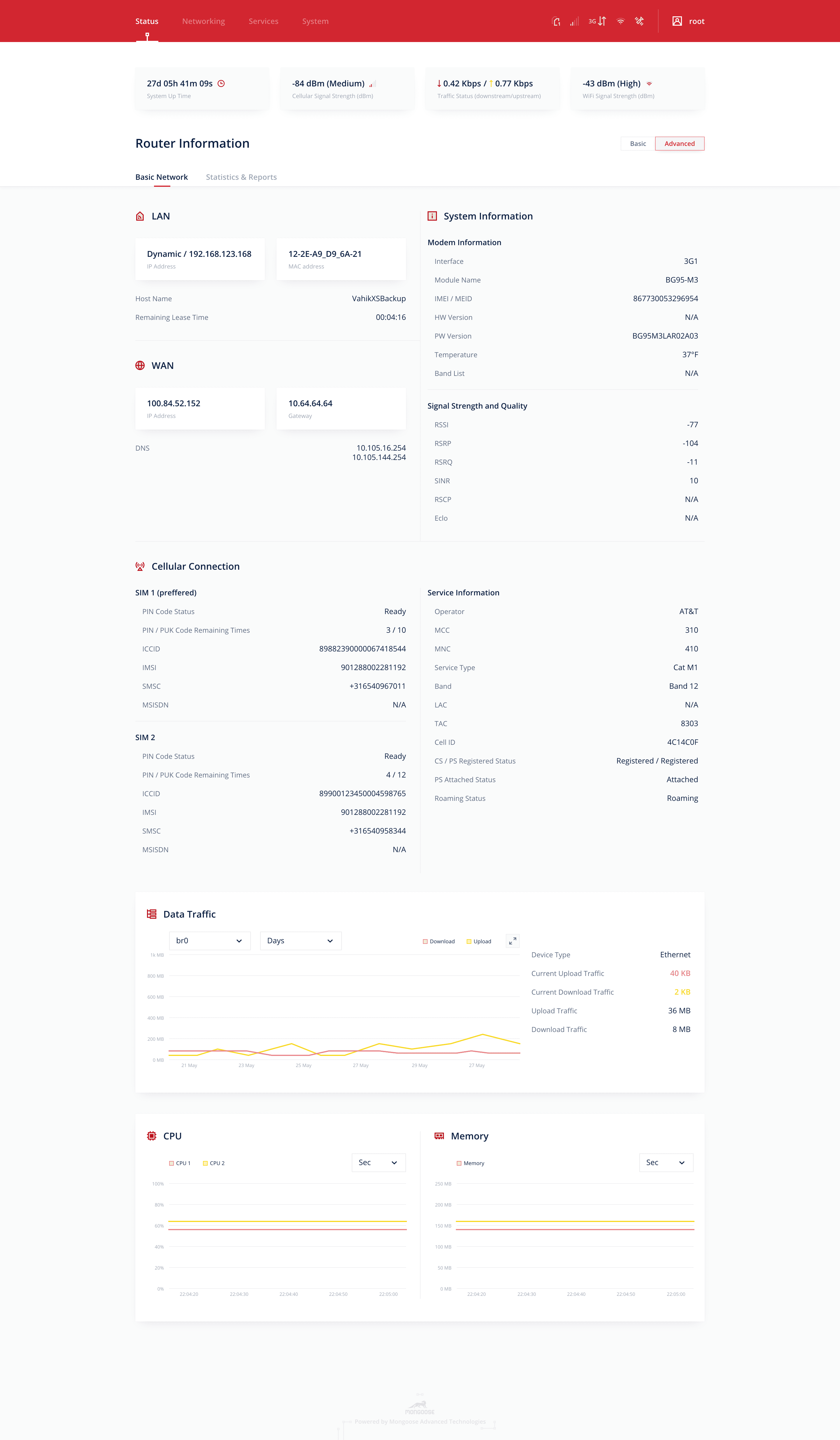
The Dashboard panel is the first screen a user sees upon log in. Here, users can access all necessary information and analytics they need, including System Information, Statuses, Cellular Connection, etc.

mongoose_router_settings_UI2
mongoose_router_settings_UI3

Log In.

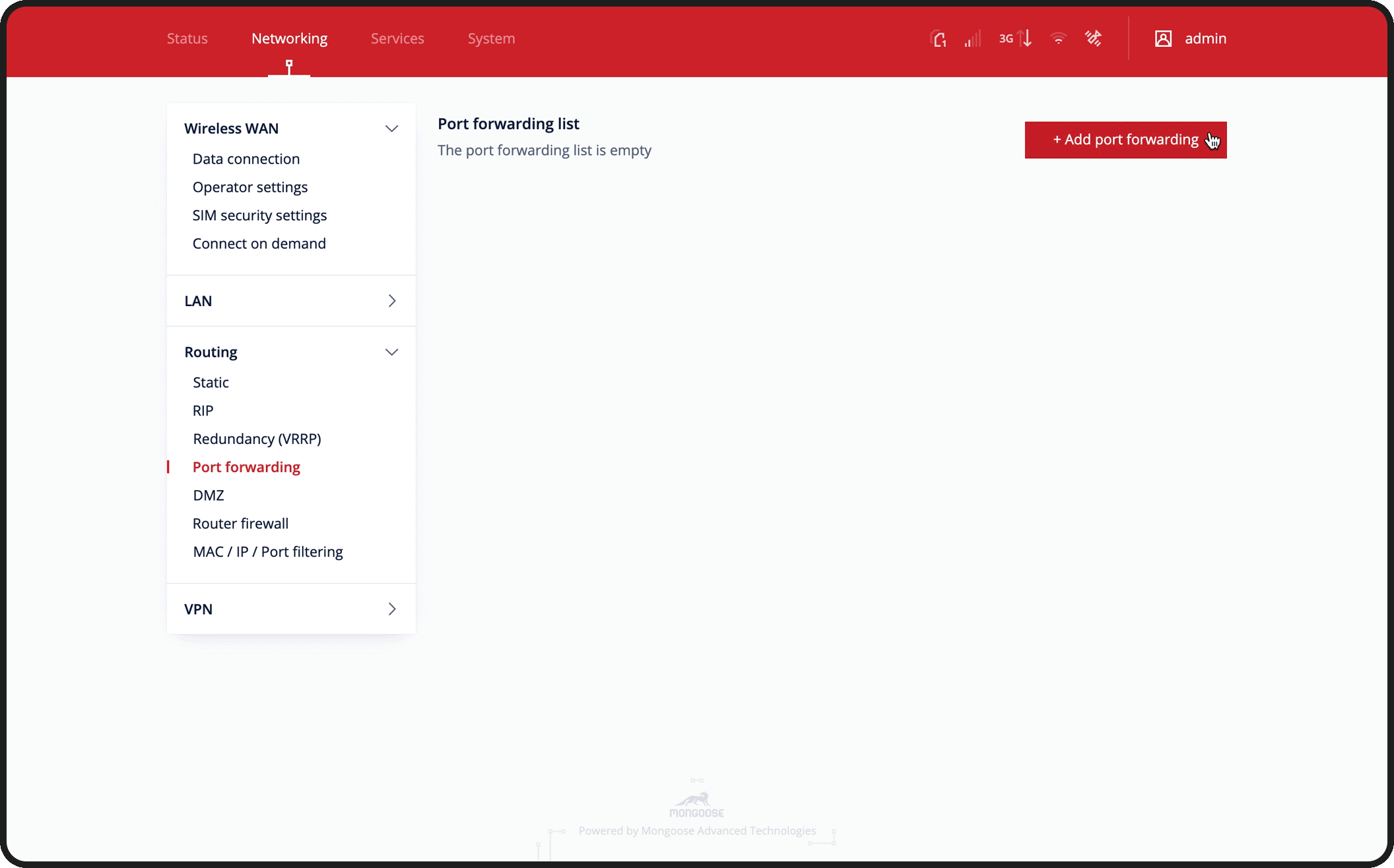
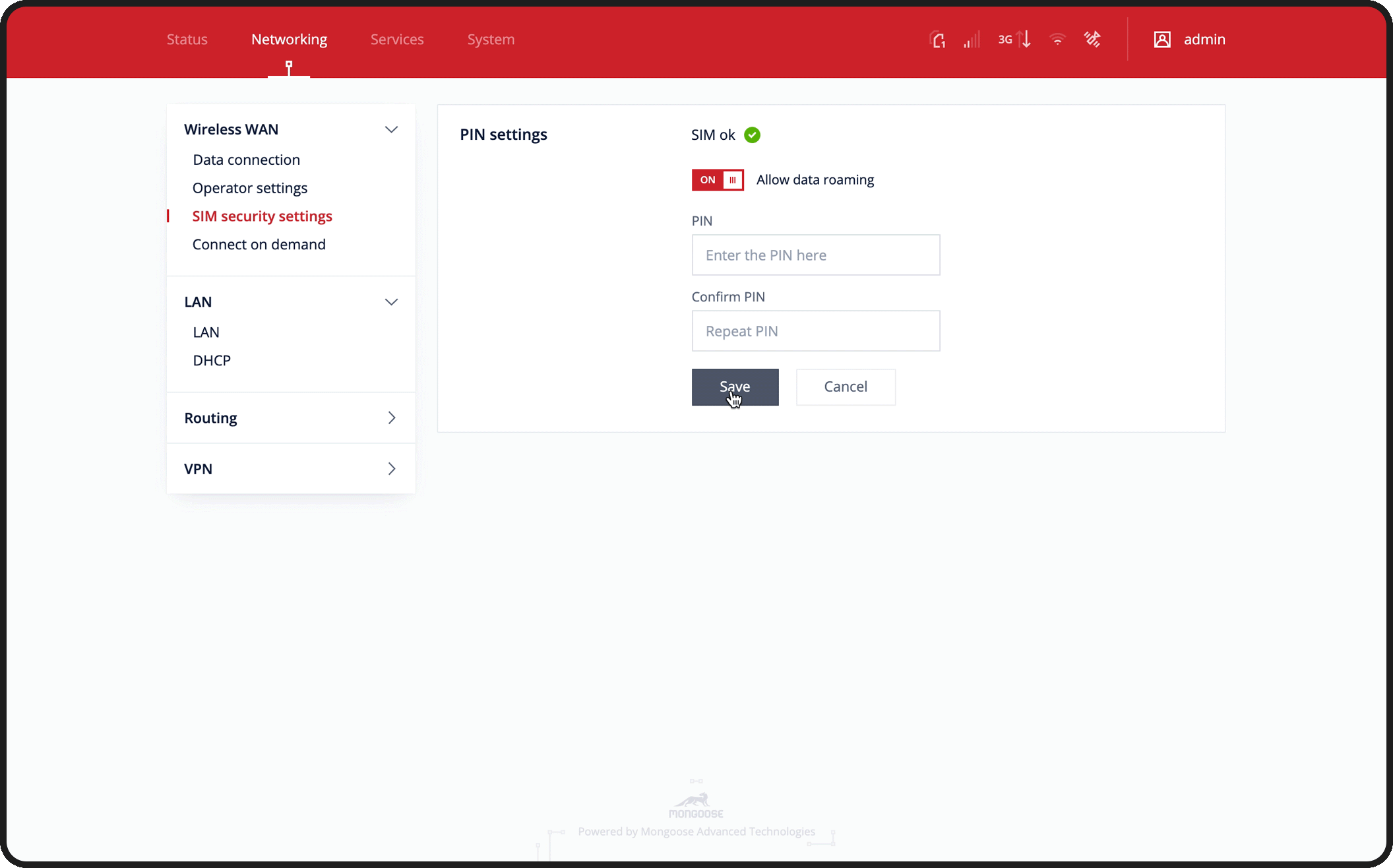
Router settings can be accessed after the user has logged into the system using a registered email and password.

mongoose_router_settings_UI4

Settings.

There are three sections under the Settings page: Networking, Services and System. Each section is made up of a number of subsections, which allows for easy navigation for users.

mongoose_router_settings_UI5
mongoose_router_settings_UI6mongoose_router_settings_UI6
mongoose_router_settings_UI7mongoose_router_settings_UI8mongoose_router_settings_UI9

Add/Edit settings & Error message.

mongoose_router_settings_UI10mongoose_router_settings_UI11_gif

Prototyping

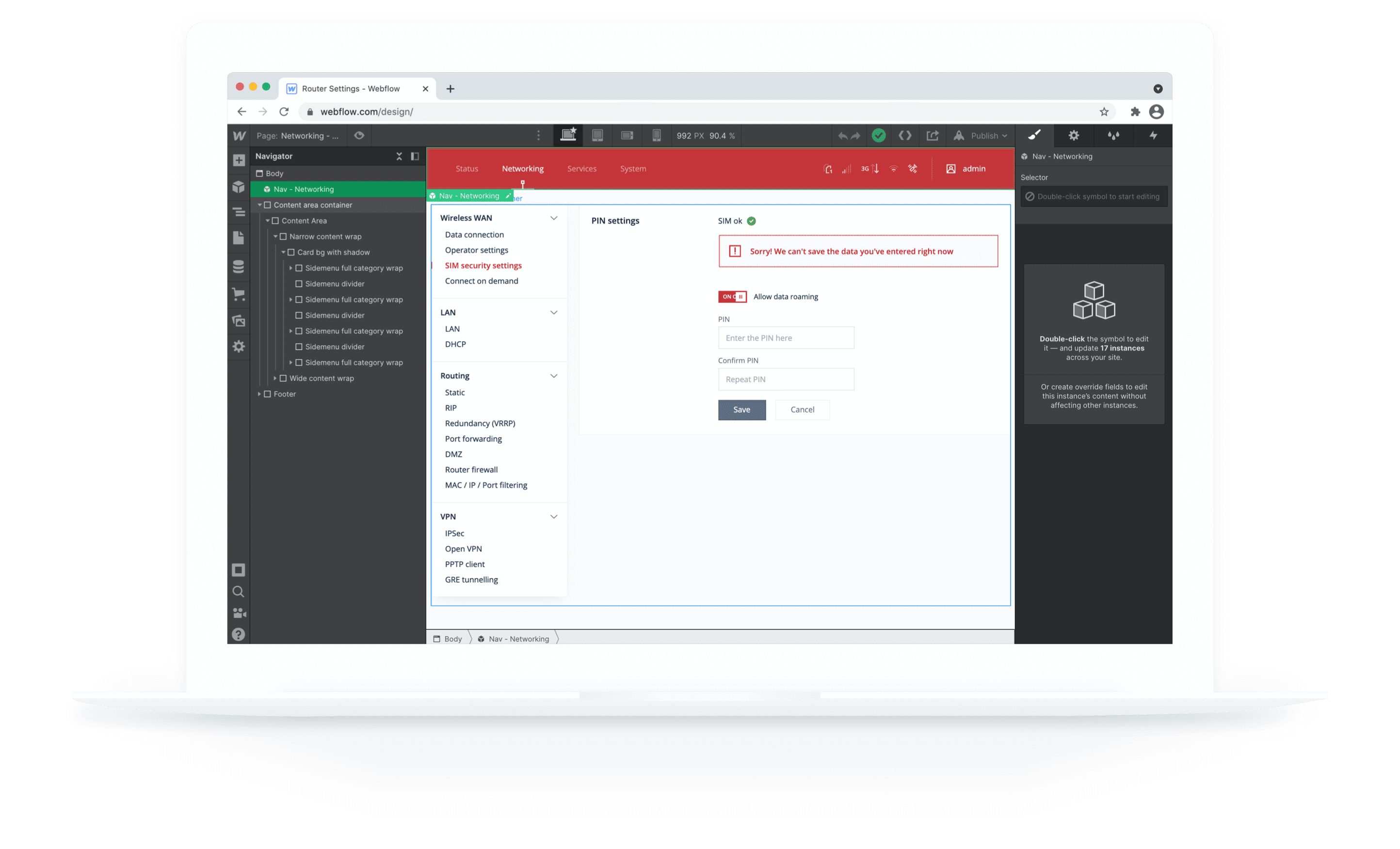
A prototype was created in Webflow using real code. This not only simplifies the entire process of future development, but it also allows both our designers and engineers to understand and be comfortable with the format. Prototyping in Webflow also combines thinking, with the natural benefits and limitations of HTML and CSS.

mcbook_presentation_img
06. Handoff

Design Specification.

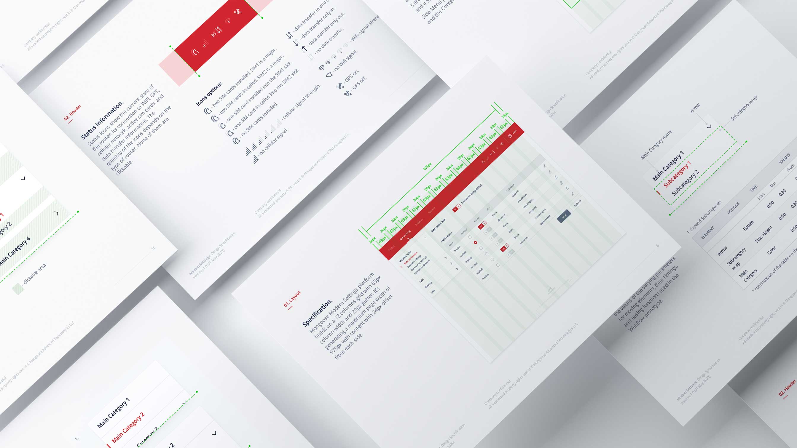
The last step in the design process was to create a Design Specification for developers. The Design Specs highlight the basic design elements and how they interact with other elements and/or scenarios. This will evolve with new project requirements. 

design_spec
small_arrow_black
Back to Design Portfolio